Start with the feeling or idea
Before choosing colors, decide what your project is about. You might be drawing a busy street, painting a quiet room, or designing a poster for a school event. Write down two or three words you want someone to associate with it, such as calm, energetic, mysterious, or playful. These words give you a direction without locking you into one “correct” set of colors.
Next, look at the subject itself. Which colors help tell its story? A picture of a garden does not have to use realistic greens, but you may want some contrast between leaves, flowers, and the background. If you are making an abstract piece, think instead about where you want the viewer’s eye to go. Your palette should support that choice.
Choose a few colors with different jobs
It is easier to begin with a small palette than to choose from every color available. Try picking one main color, one or two supporting colors, and one accent. The main color might cover the largest area. Supporting colors add variety, while an accent can draw attention to a small but important detail. You can add more later if the project needs them.
Colors can work together in different ways. Colors that sit near each other on a color wheel, such as blue and green, often create a gentle transition. Colors farther apart, such as blue and orange, can create stronger contrast. Neither approach is automatically better. For a quiet scene, you might use mostly related colors and save a contrasting accent for the focal point. For a bold poster, you might make contrast a bigger part of the plan.
Remember that light and dark matter as much as hue. If every color in your palette has a similar lightness, important shapes may blend together. Include a light, a middle, and a dark option, or plan ways to mix them. This can help a drawing remain clear even when the colors are subtle.
Make a quick palette test
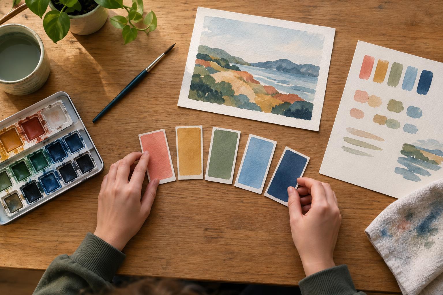
Put small samples of your chosen colors next to each other before committing to the full project. If you are painting, use the same paper and paints you plan to use in the final piece. If you are making digital art, place the swatches against your likely background color. A color can look different when it sits beside another color or covers a larger area.
Try a tiny sketch using only your selected colors. It does not need to be neat. Use it to check whether the main subject stands out and whether your accent really feels like an accent. If the result seems too busy, remove a color or use one less often. If it seems flat, try changing how light or dark one color is before adding a completely new hue.
For a project that includes words, test the text against its background. If it is hard to read at a glance, increase the light–dark difference or choose a simpler background. This is useful for posters and digital images, where the message should not depend on someone noticing a subtle color difference.
Adapt the palette to your materials
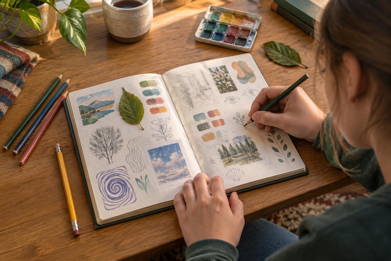
Your supplies will affect what your palette can do. Colored pencils can build color gradually through layers, while markers may leave stronger, less adjustable marks. Paint colors can mix on a palette or on the page. With collage, you work with the colors you can find, which may lead to combinations you would not have planned. Treat these limits as part of the creative challenge.
You also do not need to own an exact shade to use a palette idea. If you want a warm orange but only have red and yellow paint, make a test mix. If your digital color looks different on another screen, focus on the relationships among your colors rather than expecting them to appear identical everywhere. Keeping a small swatch sheet or a saved group of digital swatches makes it easier to stay consistent as you work.
Revise without starting over
A palette is a plan, not a rule. Partway through a project, step back and ask: What do I notice first? Does that match what I wanted to emphasize? You may find that an accent color needs to appear in fewer places, or that a dark background would make the subject clearer. Try the change on a scrap or a duplicate digital layer before changing the whole piece.
When you finish, note which choices helped and which were difficult. You might discover that you enjoy muted colors with one bright accent, or that you prefer a wider range of light and dark. Save your swatches if you like them, but keep experimenting. Building a palette gets easier when you treat each project as a chance to notice how colors work together.