A panel is a choice about time
Imagine drawing a character who notices a ball rolling toward an open gate, runs after it and catches it. You could show all three actions in one image, or give each its own panel. The basic event stays the same, but the reading experience changes. Separate panels invite readers to pause on each step and make a connection between them. One image can make the sequence feel more immediate.
A panel does not represent a fixed number of seconds. A tiny panel might capture a long wait through a picture of someone staring at a clock. A large panel might show a split-second surprise. Pace comes from the combination of images, words and the work readers do between panels. When you plan a comic, ask not only “What happens next?” but also “Which moments should readers spend time noticing?”
Use size and detail to guide attention
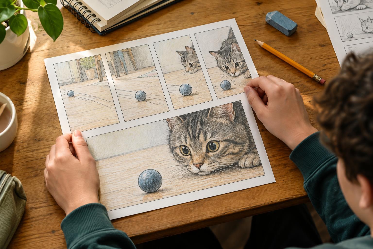
A large panel gives an image room to breathe. It can let readers explore a setting, notice a character’s expression or take in the result of an important action. Several smaller panels can create a quicker rhythm, especially when each contains one clear change: a hand reaches, a latch clicks, a door swings open. Size alone is not a speed control, though. A large panel packed with objects and dialogue may take longer to read than a large panel with a single bold shape.
Try deciding what deserves attention before choosing your layout. If the important moment is a character realizing they made a mistake, you might give their expression its own panel. If the point is a sudden scramble, a row of small, direct images may work better. Leave enough room for speech and captions to be read comfortably. Crowding them into panels can slow a reader for the wrong reason: they have to figure out where to look.
Let the space between panels do some work
The blank space between panels is often called a gutter. Readers cross it by imagining what happened in the gap. Show a cup balanced on the edge of a table in one panel and broken on the floor in the next, and readers can infer a fall without seeing every part of it. That shortcut can make a scene feel brisk. Showing the wobble, the reach to save the cup and the near miss instead can build suspense.
Repetition offers another way to stretch a moment. Three panels showing nearly the same view, with only small changes in a character’s eyes or posture, can make a silence feel noticeable. This works best when each panel adds something worth seeing. If nothing changes and the pause has no purpose, readers may wonder whether they missed a detail.
Plan for the reader’s path
Panel arrangement affects pace because readers need to know where to go next. A straightforward grid can make a conversation easy to follow. An unusual shape or overlap can add energy, but it may also cause confusion if the reading order becomes unclear. Sketch a page with simple boxes before making finished art. Then trace the route your eye takes from the first panel to the last. If you have to stop and guess, consider moving a panel or simplifying the arrangement.
If your comic has pages, consider what happens at a page turn. Ending a page just before a reveal gives readers a brief moment of anticipation. The next page can reward that pause with a clear image. You do not need a surprise on every page; a quiet transition can be just as useful when the story needs rest.
Test the pace with a short scene
Choose one simple event, such as finding a lost key. Draw two rough versions with stick figures. In the first, use three panels: search, discovery, reaction. In the second, add panels for clues, wrong guesses or a pause before the discovery. Keep the dialogue nearly the same so you can focus on what the panel choices change.
Read both versions without explaining them to someone else, and ask where they slowed down or felt unsure what happened. You can also leave the sketches for a while and return to them with fresh eyes. Notice whether a panel adds meaning, builds anticipation or merely repeats information. There is no universal number of panels for a scene. The useful layout is the one that helps readers experience the moment you wanted to share.