Mistake 1: Treating lettering like fast handwriting
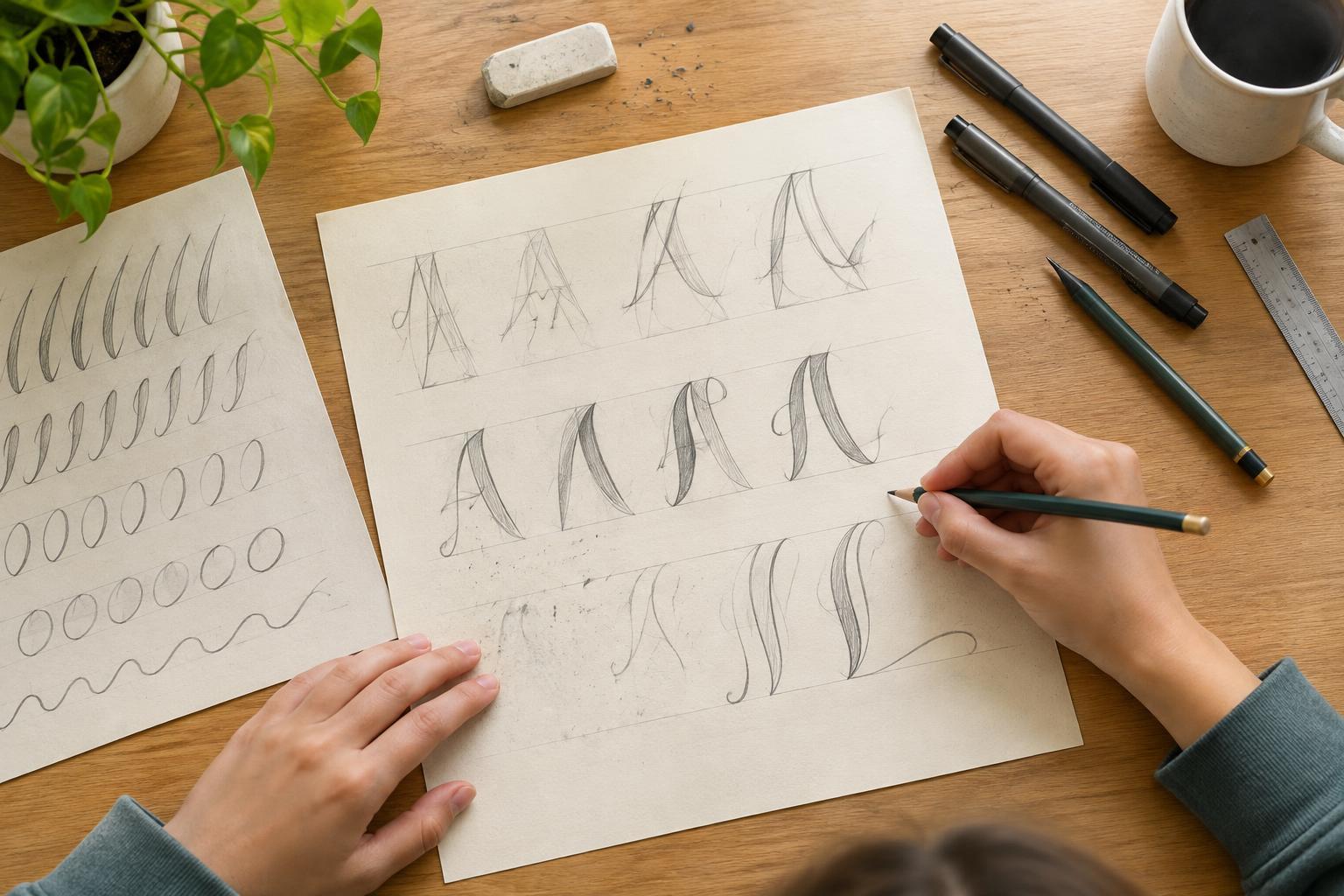
Handwriting is usually meant to be quick. Hand-lettering is closer to drawing: you can plan each letter, adjust its shape and take your time. If you rush to finish a word in one motion, letters may lean in different directions or vary in height without meaning to. Slow down and sketch the word lightly before making darker lines.
Start with a pencil and a few guidelines. Draw a baseline where most letters will sit and another line for their usual height. For rounded letters such as o and e, it can look more balanced to let their curves extend just slightly beyond those lines. The guidelines are temporary; their job is to help you notice choices, not to make every letter identical.
Mistake 2: Leaving spacing until the end
Even carefully drawn letters can make a word look uneven if the spaces between them feel too wide or too tight. The trick is to judge the visible gaps, not just the distance between letter edges. A pair of straight-sided letters creates a different-looking gap from a pair of curved letters, even when the edges are the same distance apart.
Before you ink a design, write the word in simple block letters and check its overall width. Then sketch the spaces along with the letters. Step back or look at the word from across the room: does one gap pull your attention? If so, move a letter in your pencil sketch. Adjusting early is easier than trying to squeeze an extra letter into a nearly finished design.
Mistake 3: Mixing styles without a plan
A playful letter next to a formal one can be an intentional choice. But when every letter has a different slant, curve or thickness by accident, the word can lose its sense of unity. Pick two or three features to repeat, such as rounded corners, a gentle rightward slant or tall, narrow shapes. You can add variety while keeping those features consistent.
If you want to combine styles, give each one a clear job. For example, use bold capitals for a short main word and simpler letters for the supporting text. Try drawing a few sample letters before starting the full piece. That small test can reveal whether the styles work together and whether you have enough room for both.
Mistake 4: Adding thick lines before the shapes work
Extra line weight can make lettering feel lively, but it will not fix a letter that is difficult to recognize. First, draw the word with single, light strokes. Check that each letter reads clearly and that enclosed spaces, such as the center of an a or p, have room to breathe. Only then add thicker areas.
For a common faux-calligraphy effect, thicken strokes that move downward and leave upward strokes thinner. If you are unsure where a thick section belongs, trace the letter's path slowly with your finger and notice which movements go down. You do not need a special pen: a pencil and ordinary marker are enough to practice. Leave the design in pencil until you are happy with the shapes, then ink it carefully.
Mistake 5: Decorating before checking readability
Shadows, flourishes and tiny illustrations can make a piece feel personal. They can also compete with the message if they crowd the letters. Before adding decoration, ask someone to read your word at a glance, or cover the decorations in your sketch and check it yourself. If the word is hard to read, simplify the letter shapes or increase the space around them.
Save more elaborate details for places where they will not obscure a letter. A small accent beside a word may be more effective than a flourish crossing through it. When a piece is finished, notice one thing that worked and one thing you would change next time. Keeping those notes turns mistakes into useful practice rather than reasons to start over.